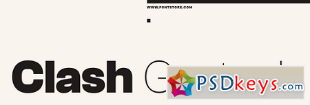
 Clash Grotesk Display Font Family - 6 Fonts
OTF | 134 Kb
Clash Grotesk Display is a family of sans serif fonts for use in large sizes. While the design of the family’s six styles – ranging in weight from Extralight through Bold – is generally neo-grotesk in style, one feature immediately sets them apart from other typefaces of that genre: The letterforms have very small ‘apertures’. These are the openings at the edges of counterforms; if you look at the ‘c’, for instance, the space between ends of the arms on the letter’s right-hand side is very small. It almost looks like that aperture is about to close shut. Clash Grotesk Display is eye catching, but its ‘design trick’ does not go overboard. The typeface is tame enough to be used in corporate identity work, while remaining exciting enough for editorial designers. Clash Grotesk Display has a companion family available for use in smaller-sized text: Clash Grotesk. In terms of design, the biggest difference between Clash Grotesk Display and Clash Grotesk is that the later typeface’s letterforms are drawn with strokes that are optically monolinear, while the letterforms in Clash Grotesk Display have much more stroke-contrast. As the Clash Grotesk Display family’s weights get heavier, the contrast in the letterforms’ stroke connections becomes very prominent. Their appearance becomes quite ‘pinched’. Clash Grotesk Display’s numerals are proportional lining figures, just as tall as tops of the uppercase letters. The lowercase’s ascenders rise up to this common capital/numeral height, too. The fonts’ x-height is tall. Clash Grotesk Display’s lowercase ‘a’ is double-story, while its ‘g’ is single-storey.
Download File:To fast download - Please register an account premium via link download below


