 Schmalfette Font
OTF | 15 Kb
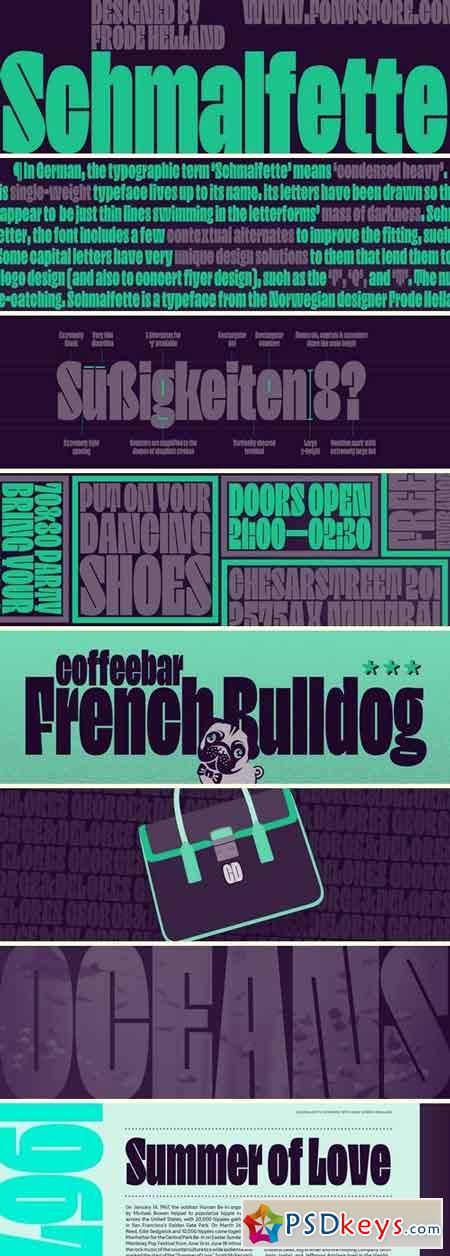
In German, the typographic term ‘Schmalfette’ means ‘condensed heavy’. This single-weight typeface lives up to its name. Its letters have been drawn so that they are both narrow and dark. The counterforms are particularly interesting, as they appear to be just thin lines swimming in the letterforms’ mass of darkness. Schmalfette is spaced very tightly; the amount of white space placed between each letter is optically about the same size as those line-thin counters. To make this work even better, the font includes a few contextual alternates to improve the fitting, such as a ‘j’ with a different tail and a few separate versions of the ‘g’, each of which has a subtly different treatment of the descending loop. Schmalfette’s x-height is tall, and its ascenders rise to the exact same height shared by the tops of capital letters and numerals. Some capital letters have very unique design solutions to them that lend them to logo design (and also to concert flyer design), such as the ‘F’, ‘Q’, and ’T’. The numerals are also all quite eye-catching. Schmalfette is a typeface from the Norwegian designer Frode Helland.
Download File:To fast download - Please register an account premium via link download below
Tags: Schmalfette, Font

