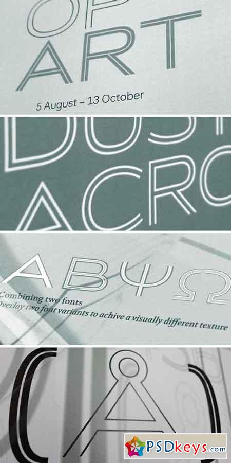
 Capline Font Family
OTF | 8 Fonts | + JPG Preview | 817 Kb
The origins of the Capline font lie in a commission for the UK-based company Peel Hunt. The original typeface has two parts that combine. Each part is set in a different colour and the two overlay and lock together to make a whole. An inline version was designed for possible use when more than one colour was not an option. Capline develops this inline version. The detail is increased from a thin inline to a thick inline across five stages. The question then arises ‘when does inline become outline?’. The change to the inline gives the lettershapes different visual weights across the family. The Heavy font has a thin inline, whereas the Thin font has a heavy inline. The Regular font is visually balanced to appear even. The only element to change across the typeface family is the inline. The outside shapes, spacing and kerning remain the same. This allows the fonts to be layered which in turn gives rise to a multitude of visual results. One technical issue was hinting. A slightly unorthodox approach was taken. In the thinner weights the stems are hinted as is usual, yet in the heavier weights the inline is hinted.
TO DOWNLOAD FAST and DONT WAIT - PLEASE REGISTER a NEW ACCOUNT PREMIUM THROUGH MY DOWNLOAD LINK BELOW: RAPIDGATOR, Nitroflare, PREFILES, UPLOADED.
Download - Always Support reupload for PREMIUM USER:
Tags: Capline, Font, Family

