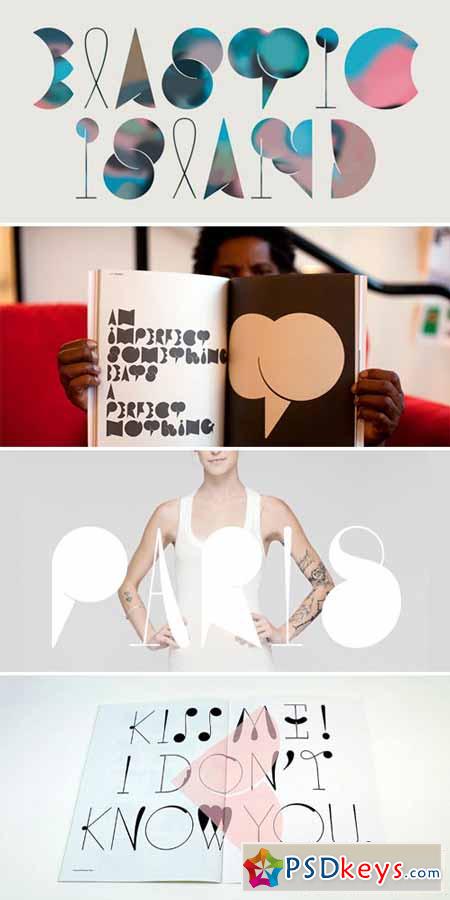
 Cumulus and Foam Font Family
OTF | 3 Fonts | JPG Preview | 1.1 Mb
Cumulus & Foam, the most beautifully grotesque font of our time. As it is in life, it is in art: beautiful is easy, reassuring, and affirming. It commands a comfortable space, and reliably adheres to the rules established therein. In its style, message, and momentum, beautiful is a confirmation that our systems make sense, and, in its most successful form, allows us to inhabit that proof. And we are blissful to be there! It is a space that hears our tremors, and responds with a mollifying "hush". In this way, beautiful itself did not need to be created; it was created because it is needed. What, then, of the unbeautiful? The value of a dischordant note, garish palette, misshapen form? Cumulus & Foam is a specimen for such investigation. In Stefan Kjartansson's newly-minted font, the characters spawn awkward spaces and strange intersections. Dialogues within the unruly family are without agreed message, and the three uppercase typefaces - with surnames Crumpet, Vane, Naugahyde - have abandoned the classic unifying key. Their influences are discernible - brash collisions of the 1980s, art deco's voluptuous bubbles, and dadaism's implausible juxtapositions - but otherwise they are incorrigible. In short, they don't seem to be listening to the rules of beauty, and they don't really care. And herein a freedom was born. They tease us with allusions to peacocks, mustaches, umbrellas and feathers. They blossom, heave, and knock each other around. They are a glorious parade of grotesque enthusiasts. They offer proof of nothing. The duty of the unbeautiful is not to affirm; rather, it is to develop. And development is directed by discomfort. Like other unbeautiful creations, Cumulus is not an easy read. Its delicate origins (in Didot) are perceptible, but this familiarity is cloaked with malproportioned outgrowths and misfigured swellings. Not only have the characters all but eluded recognition, there is a sense that they haven't ceased to form. As clouds transmogrify when borrowed for a dream, so does Cumulus bloom and thrust when committed to a baseline. The relationship between letterform and hand is inverted. This prompts a second thought. What does it spell, and what does it mean. What else could it spell, what else could it mean? Directing the protean elements almost becomes a process of mutual adaptation. As nuances are discerned, Cumulus nudges and we reconsider. And what was previously an absence - of reassuring proofs - is now a different sort of beauty: a coalescence of disjointed systems with all sorts of notions. Pitch-perfect articulation is possible, though final messages might surprise. Cumulus is not passive, though it will negotiate. And by the time you've all agreed, Cumulus has won. It revels and dominates, its reign unchecked. Even when airbrushed.
TO DOWNLOAD FAST and DONT WAIT - PLEASE REGISTER a NEW ACCOUNT PREMIUM THROUGH MY DOWNLOAD LINK BELOW: RAPIDGATOR, Nitroflare, PREFILES, UPLOADED.
Download - Always Support reupload for PREMIUM USER:
Tags: Cumulus, Foam, Font, Family

